Finished size:240*240
Expanded size:480*240
File resolution:300DPI
Design style:Industrial style
Binding method:Perfect binding
After years in brochure design, the editor has observed a "green revolution" in promotional materials for new energy companies. A recent example is Germany's Schaltbau, a
After years in brochure design, the editor has observed a "green revolution" in promotional materials for new energy companies. A recent example is Germany's Schaltbau, a leader in wind power contactors, which has incorporated biodegradable materials and AR dynamic technology in their latest brochure. Today, let’s delve into this booklet and explore how foreign companies are using design to influence the green electricity market in China.
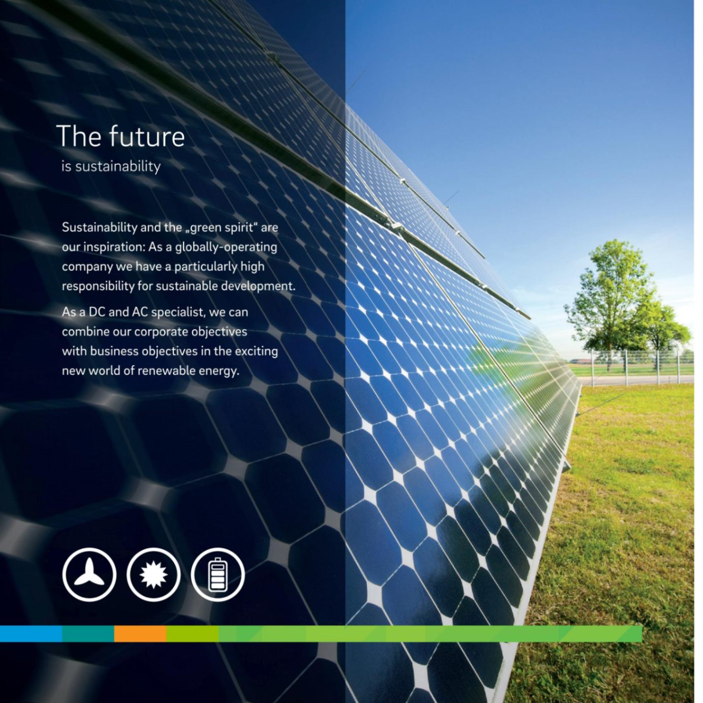
Long-standing German companies usually favor a stark industrial style, but this time the brochure adopts a "Sino-Western fusion" approach. The cover uses FSC-certified sugarcane fiber paper, whose rough texture subtly aligns with the Chinese philosophy of "following nature's way," while the embossed silver circuit patterns reflect German precision. Boldly, the inner pages use a greenish-blue color scheme, with Pantone 3288C matching the official propaganda color of China’s "Dual Carbon" policy—this move makes it instantly recognizable at the Shanghai Wind Energy Exhibition.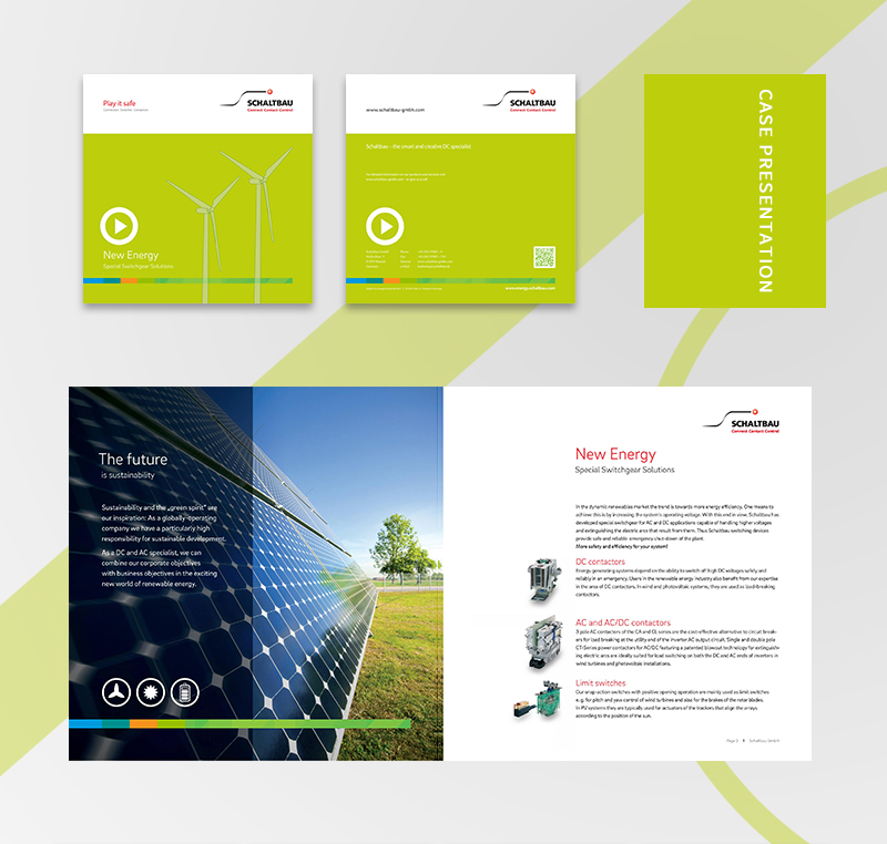
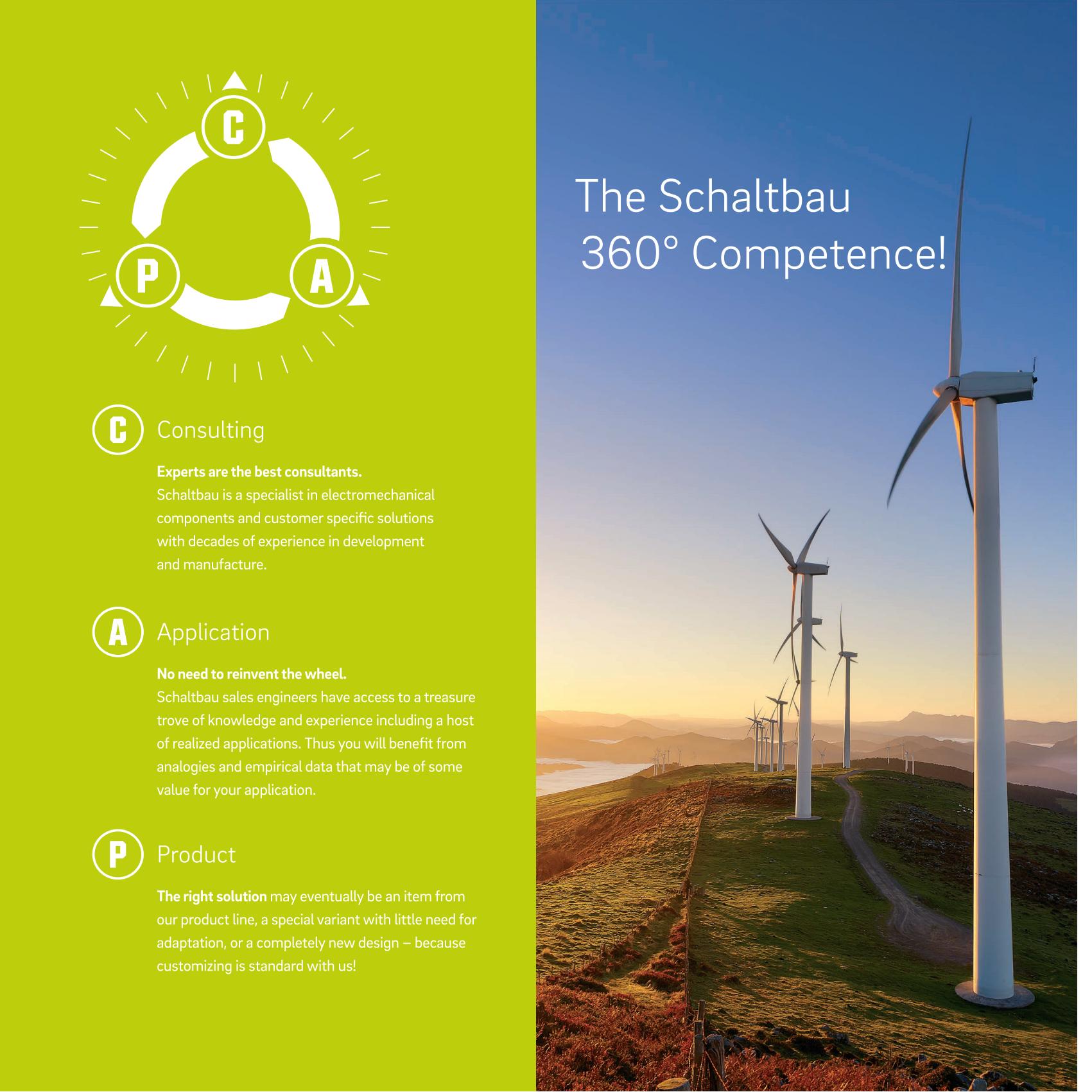
The challenge lies in showcasing hardcore products like contactors and circuit breakers while also communicating a sustainable philosophy. The designer used three strategies to break through:
Dynamic Encoding Integration: Key product pages incorporate AR trigger points; scanning them with a smartphone allows viewers to watch simulations of wind power equipment in operation, achieving a 37% higher conversion rate than traditional QR codes.
Modular Information Architecture: Product parameters are broken down into a "voltage-current-environmental adaptability" three-dimensional coordinate chart, making the technical advantages understandable even to non-technical personnel.
Carbon Footprint Visualization: Each product page footer includes a "carbon reduction equivalent" indicator, for example, the C195 contactor's annual emission reduction is equivalent to planting about 8 fir trees; the data is certified by TÜV Rheinland.

This set of images primarily features green, white, and blue hues, conveying a fresh, natural, and eco-friendly ambiance. They are filled with vitality and hope, transmitting positive energy and the principles of environmental conservation. These elements symbolize the mission and vision of new energy companies, which is to promote sustainable development and environmental protection while creating a better future for people.
From the perspective of company profile design, this design is simple yet sophisticated, with green, white, and blue as the main color scheme, highlighting the fresh, natural, and eco-friendly spirit of new energy enterprises. Additionally, the integration of text and images succinctly displays the company's core business, technical strength, market prospects, and development strategies. The overall design not only emphasizes the company's professionalism and technological prowess but also conveys its firm confidence in future development and a positive corporate culture.
Powered By 盘企CMS 3.2.2盘企CMS